|
Color Correct Light and Design

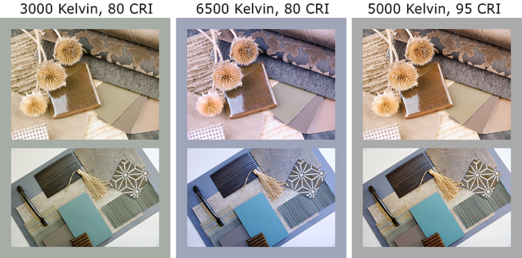
The photos above represent what happens under three different lighting scenarios. The Kelvin rating is evident as it represents the room's ambient light from warm to cool. Color designed under warm light will change in appearance under cool lighting and visa-versa. If many people are involved in the design process (including the client) and they are each using different light spectrums in the design process, costly reworks are likely to occur.
CRI stands for the Color Rendering Index rating of the lamp—what happens to the color when the light hits an object—it’s rendering ability. A CRI rating of 80 or less will limit the ability to see the object’s full color palette. In the pastel range, pastel colors may be difficult to differentiate. In the deeper color ranges or if there is a translucent coating, the light will reflect off and the object’s true color will not be observed.
"The Tale of Two Couches'' has a real world application.
Lights with a high CRI rating help those who are creating a finished piece to see what the original designer of the fabric, tile or material (paper, cloth, wood, laminate, etc.) had in mind. Some are subtle additions to an object’s design, and some are more obvious. Being able to fully see these will help you to coordinate the “real” colors.
When presenting under these lights, your colors pop. They are more defined with higher contrast. It can add to the impact of a presentation. For example, a jewler will use special lighting to enhance the brilliance and color of a diamond. Our lights simply enhance your design work, bringing out the best in materials, colors, and your talent.
Home
© 1999-2025 CRS Light
|